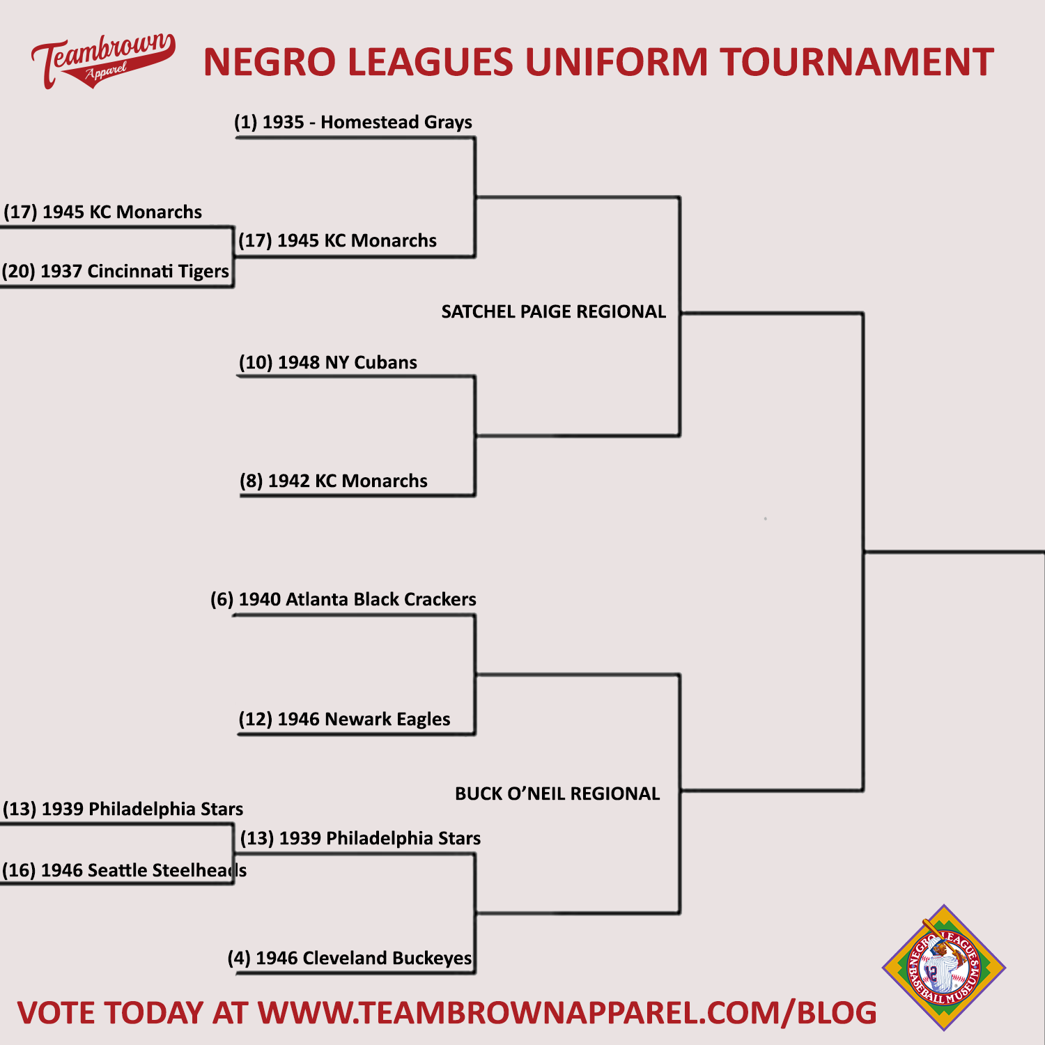
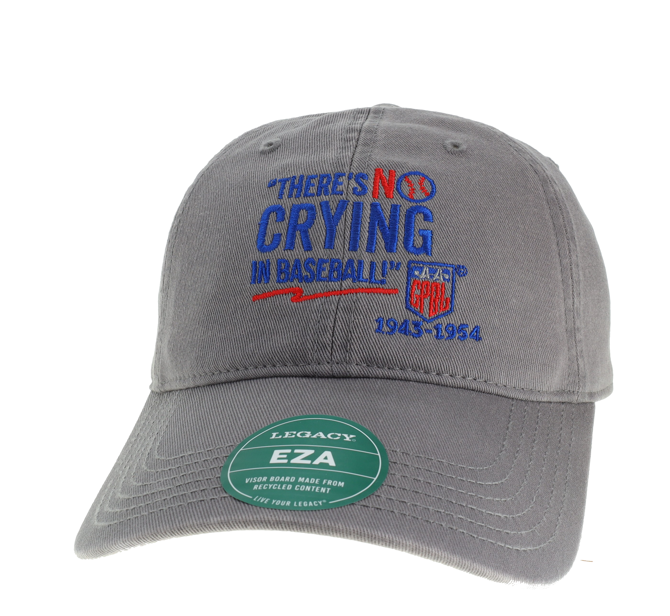
This week’s Spotlight is a celebration of the opening of another incredible Baseball season. We are also going to pay tribute to another great tradition of March Madness and do a bracket for the best uniform in Negro Leagues History.
We need you to pick the winners!
Our field and rankings are brought to us by the incomparable Phil Hecken - Uniform Aficionado & Deputy Editor of Uni Watch, a website devoted to the Obsessive Study of Athletic Aesthetics.
Phil also used to write for the Sporting News and has been quoted in the Washington Post and had some sports photography appear on ESPN

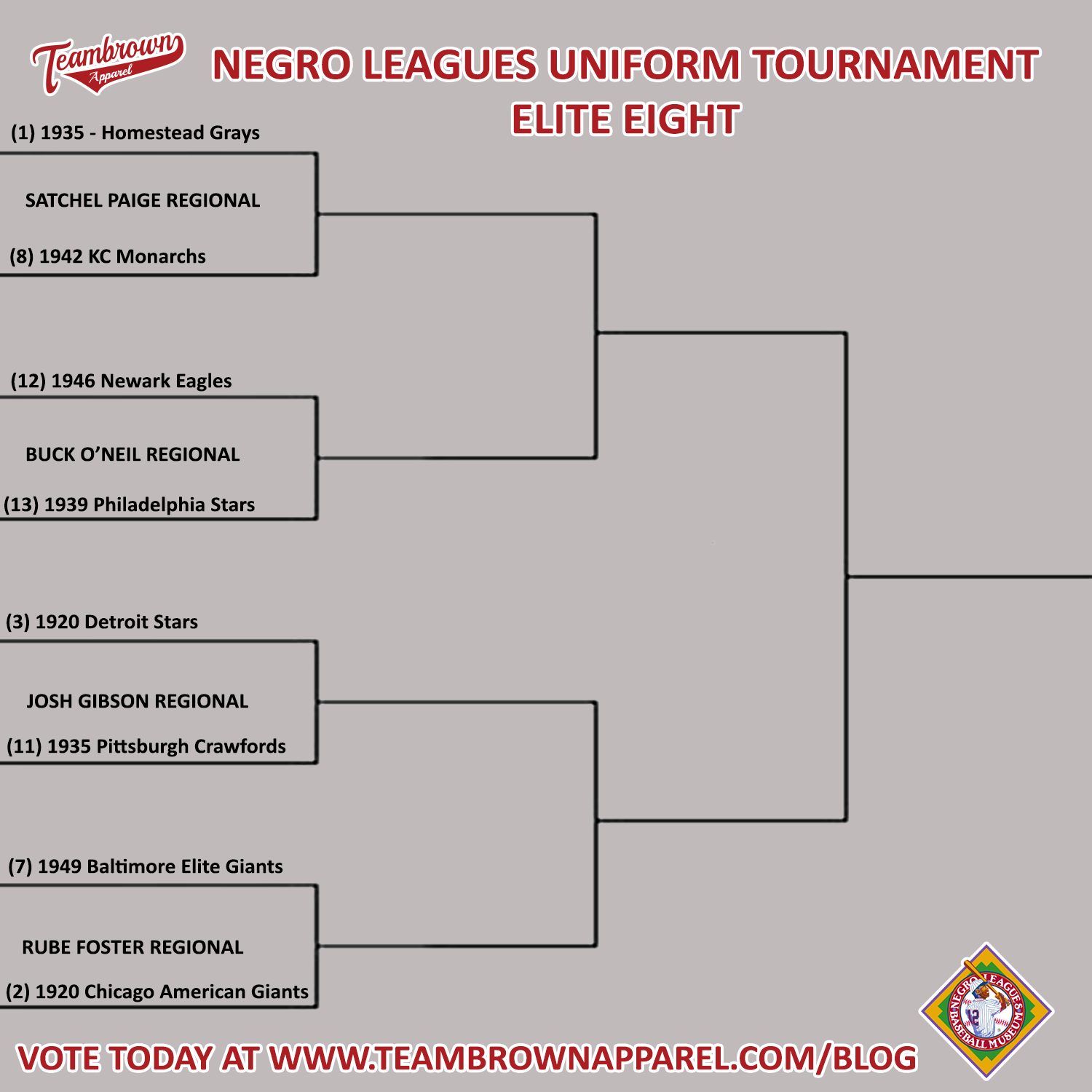
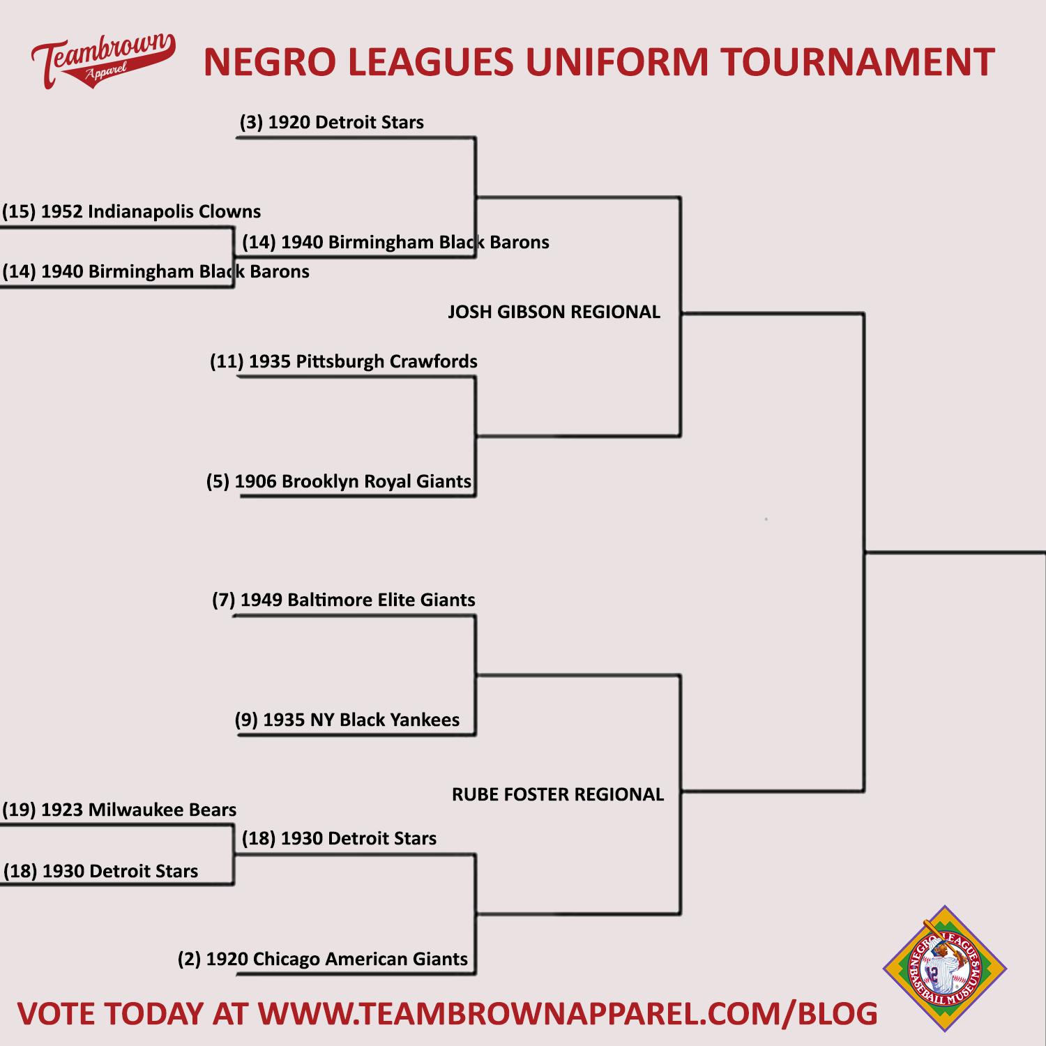
Today – the 2nd half of the Sweet Sixteen
The Josh Gibson Regional and the Rube Foster Regional
The 3rd seed – The 1920 Detroit Stars vs. the 14th seed 1940 Birmingham Black Barons.
First up is #3 1920 Detroit Stars - The Stars had several great uniforms, but this one is easily my favorite. The solid midnight blue (I think) placket piping, the red "DET" and "OIT" with the white "R" and red star are a look that would look great today. Fortunately, the Detroit Tigers have brought this uniform to life during NLB throwback games.
Coming in at #14 - 1940 Birmingham Black Barons – Phil’s comments – “another jersey that was fairly simple in its elegance at first glance, but a closer look reveals full black-and-red piping and a drop shadow under ‘Barons’, the team combined this jersey with a great BBB logoed-cap.”
VOTE in the comments below
#3 - 1920 Detroit Stars vs. #14 - 1940 Birmingham Black Barons
Next is the 2nd seed – The 1920 Chicago American Giants vs. 18th seed – The 1930 Detroit Stars.
The #2 seed 1920 Chicago American Giants - Phil's comments - "This could easily be my favorite NLB uni of all time (which the Chicago White Sox threw back to some years ago). Like the solid dark Royal Giants, I love how this one looks. And while I don't normally like pinstripes on a road uniform, I'm in love with this one."
Next is the 18th seed – The 1930 Detroit Stars
Coming in at #18 - 1930 Detroit Stars – Phil’s comments – “another team on my original Top 10, the Stars had a couple sets of great uniforms. This one, wonderfully recreated by the Detroit Tigers for a Negro League throwback game. The uniform was bereft of any words, relying simply on the power of the red star on the jersey and cap. It was all they’d need.”
VOTE in the comments below
#2 - 1920 Chicago American Giants vs. #18 - 1930 Detroit Stars
Next is the 5th seed - 1906 Brooklyn Royal Giants vs. the 11th seed – The 1935 Pittsburgh Crawfords.
Next is the 5th seed - 1906 Brooklyn Royal Giants - Phil's comments - "As you'll see, I have a thing for dark monochrome uniforms, and the 1906 Royal Giants fit this list. It didn't hurt that the New York Mets attempted to bring this beautiful uniform back to life in a pair of NLB throwback games. I wish more MLB teams would attempt to pair their dark "softball" (alternate) jerseys with a pair of matching pants. This was a great look."
Coming in at #11 - 1935 Pittsburgh Crawfords – Phil's comments "it was hard to leave this uni off the Top 10. The pinstripes, the red piping and script Crawfords would actually seem not to work together, but yet they do, beautifully. It didn’t hurt that Josh Gibson wore this either."
VOTE in the comments below
#5 - 1906 Brooklyn Royal Giants vs. #11 - 1935 Pittsburgh Crawfords
Next is the 7th seed - 1949 Baltimore Elite Giants vs. the 9th seed – The 1935 NY Black Yankees.
First is the 7th seed - 1949 Baltimore Elite Giants - This is one of my favorite road jerseys of all time. Clearly not designed for TV, you had to be very close to this one to read the "ELITE GIANTS" contained in the tail of the script. But that's part of the beauty of it. The "Baltimore" script is magnificent as well.

Finally the #9 seed - 1935 New York Black Yankees - Phil's comments - "This uniform was clearly meant to mimic their white counterparts from the Bronx, and its simplicity is what makes it so great. I actually prefer the road uniform (which reads "NEW YORK") to the home jersey as I prefer the way the city reads over the chunkiness of "YAN K EES" on the home."
VOTE in the comments below
#7 - 1949 Baltimore Elite Giants vs. #9 - 1935 NY Black Yankees.
#HistoryInYourSize