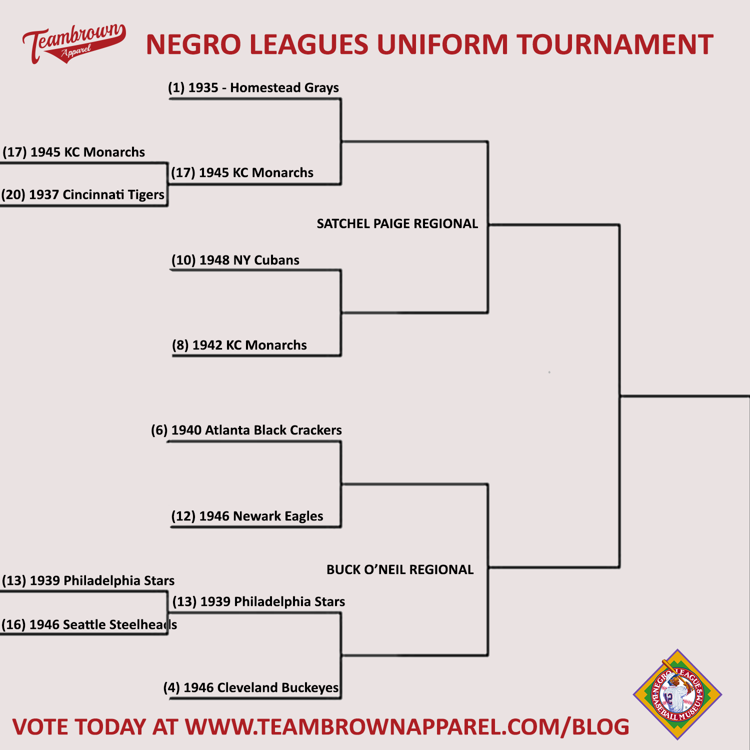
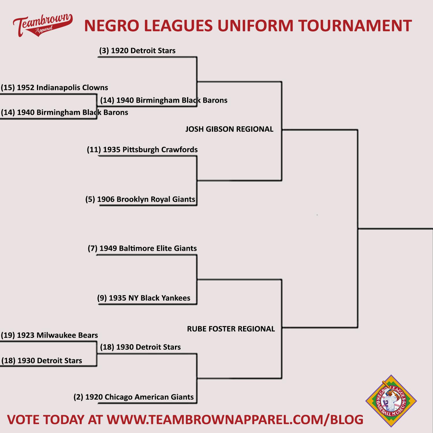
This week’s Spotlight is a celebration of the opening of another incredible Baseball season. We are also going to pay tribute to another great tradition of March Madness and do a bracket for the best uniform in Negro Leagues History.
We need you to pick the winners!
Our field and rankings are brought to us by the incomparable Phil Hecken - Uniform Aficionado & Deputy Editor of Uni Watch, a website devoted to the Obsessive Study of Athletic Aesthetics.
Phil also used to write for the Sporting News and has been quoted in the Washington Post and had some sports photography appear on ESPN

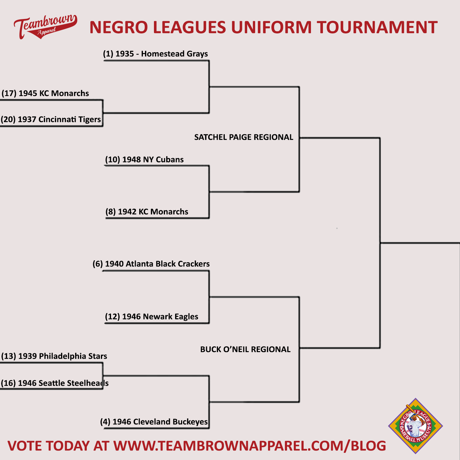
Today – the 1st half of the Sweet Sixteen
The Satchel Paige Regional and the Buck O'Neil Regional
Today we feature our 1st seed – The 1935 Homestead Grays vs. the 17th seed 1945 Kansas City Monarchs.
The #1 seed is the 1935 Homestead Grays – Phil’s comments “There are several iterations of the Grays unis I love, but this one is probably my most favorite. The thin, elegant ‘Tiffany’ font, the subtle arching and bold piping, and of course, seeing it on Josh Gibson makes it my top NLB jersey.”
The 1945 Kansas City Monarchs – Phil’s comments – “I had the Monarchs in my Top 10 (but that was the 1942 squad). This one is almost as good. The giant “KC” and three-fourths placket piping are beautiful and can be read from space. This uniform was also worn by my favorite ballplayer of all time, so it’s also got that going for it.”
VOTE in the comments below
#1 - 1935 Homestead Grays vs. #17 - 1945 Kansas City Monarchs
Next is the 4th seed – The 1946 Cleveland Buckeyes vs. the 13th seed – The 1939 Philadelphia Stars.
The #4 seed - 1946 Cleveland Buckeyes – Phil’s comments – “like the Baltimore Elite Giants, this was another team who stuck a subtle name within the tail of their script. This was another one brought to life recently when the Cleveland Indians donned a cream version of this jersey. That team should just ditch their current name, change it to "Buckeyes," and wear those home and roads forever.”
Next is the 13th seed – The 1939 Philadelphia Stars.
Coming in at #13 - 1939 Philadelphia Stars – Phil’s comments “throughout their history, the Stars always had nice uniforms, but for some reason, this particular iteration always stands out for me, the abbreviated “PHILA.” (w/colored button for a period!) spread across chest (as opposed to stacked version of later vintage) is endearing.”
VOTE in the comments below
#4 - 1946 Cleveland Buckeyes vs. #13 - 1939 Philadelphia Stars
Next up is the 8th seed – 1942 Kansas City Monarchs vs. the 10th seed - 1948 New York Cubans.
The 8th seed - 1942 Kansas City Monarchs – Phil’s comments “I LOOOOOOVE this one. The beautifully vertically arched "MONARCHS," the piping, the red sleeves. It all works so well together. It was great seeing the KC Royals bring this to life during several of the NLB throwback games. There are several great Monarchs unis, but this one may be their best yet. And anyone who knows their history knows '42 was a great year for the team!”
The 10th seed - 1948 New York Cubans – Phil’s comments “There's just something about this jersey that stands out -- the beautiful red piping atop pinstripes (a look I normally don't like) that just works here. The black bat underlining New York, through the "C" in Cubans and crossing the rubicon all work together fantastically. “

VOTE in the comments below
#8 - 1946 Cleveland Buckeyes vs. #10 - 1942 Kansas City Monarchs.
Next up is the 6th seed – the 1940 Atlanta Black Crackers vs. the #12 seed 1946 Newark Eagles.
The #6 seed - Circa 1940 Atlanta Black Crackers – Phil’s comments - “The ABC had a number of wonderful logos, my favorite being the interlocking ABC, but my favorite uniform was probably the circa 1940 "ABC" uniform with the large red radially arched "ABC" across the chest, with solid black piping set atop subtle thin pinstripes. Just gorgeous.”
Coming in at #12 - 1946 Newark Eagles – Phil’s comments - the team that won the 1946 Negro League Championship also did so wearing their finest uniform, it was beautifully simple, with merely “Eagles” in script on the front, and an elegant “E” on the cap. No frills. Just perfection.”
VOTE in the comments below
#6 - 1940 Atlanta Black Crackers vs. #12 - 1946 Newark Eagles
#HistoryInYourSize

